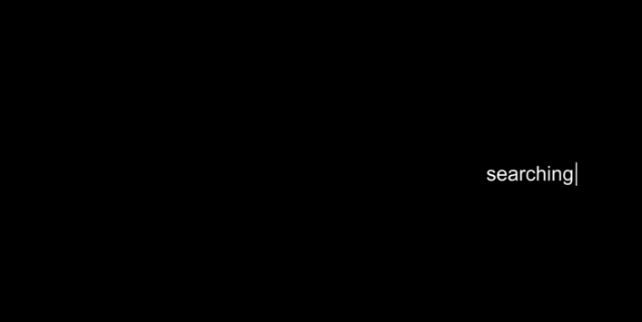
- The reason behind choosing this font is it’s utmost simplicity in regards to the actual frame. The title is rather tucked away which allows for it to be rather discrete in comparison to the bigger picture. However, in our introduction, we wish to tuck it away amongst the other items in the frame. We don’t intend on using a black screen.
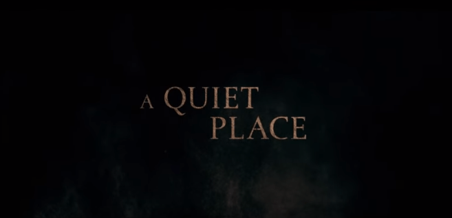
- The reason why this title was selected as inspiration is the incorporation of a very dull color. While not being a total absence of color, the grayish-brown color selected for the title sequence may suggest a rather grim or depressing movie.
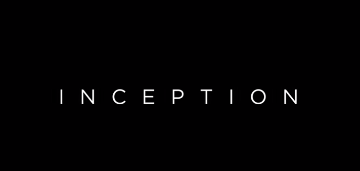
- What we wish to incorporate about this title sequence is the clever use of spacing. The use of spacing may hint at a rather delusional or mind-warping experience that is present in the movie, “Inception”. My group and I may utilize this in order to relay that same effect.
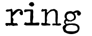 Traveling typewriter
- This font may introduce more of a cliche horror feel to the title. In most horror movies, the title sequences may appear ancient or older in order to create an eerie sensation.
 Comfortaa Regular
- This font may introduce a more simplistic approach to the movie. This could create a feeling as if everything’s going to be ok and nothing could possibly go wrong.
 Coolvetica
- This font creates a similar feeling as the previous one. However, this font is bolder. In some people’s opinions, this may be a more creative and appealing alternative.


